Here's why the long-awaited return of maximalist interiors is exactly what we need...

Maximalism lovers, it’s our time to shine! FINALLY the seemingly never-ending era of grey minimalism is being swapped out for prints, colours and textures…hooray… Maximalist interiors are here to stay!
I have a Google alert set for ‘maximalist interiors’ and over the last two months I’ve seen a huge increase in those keywords generating results.
Articles, blog posts, spotlights and interviews with designers and home owners are flooding my inbox to cement the fact that people are tired of the soulless, utilitarian house and instead are craving a ‘lived in’ home.
I think the reason for this shift is largely a reflection of what’s going on in the world. Here in the UK, we haven’t had any respite from soaring bills and crippling mortgages, we’ve seen one tyrannical government be replaced by…well, they’ve taken away pensioners winter heating subsidies and they’re set to make life harder for small businesses so…
Regardless, we’re seeing more and more colourful and interesting spaces in the interior design world & that’s worth celebrating.
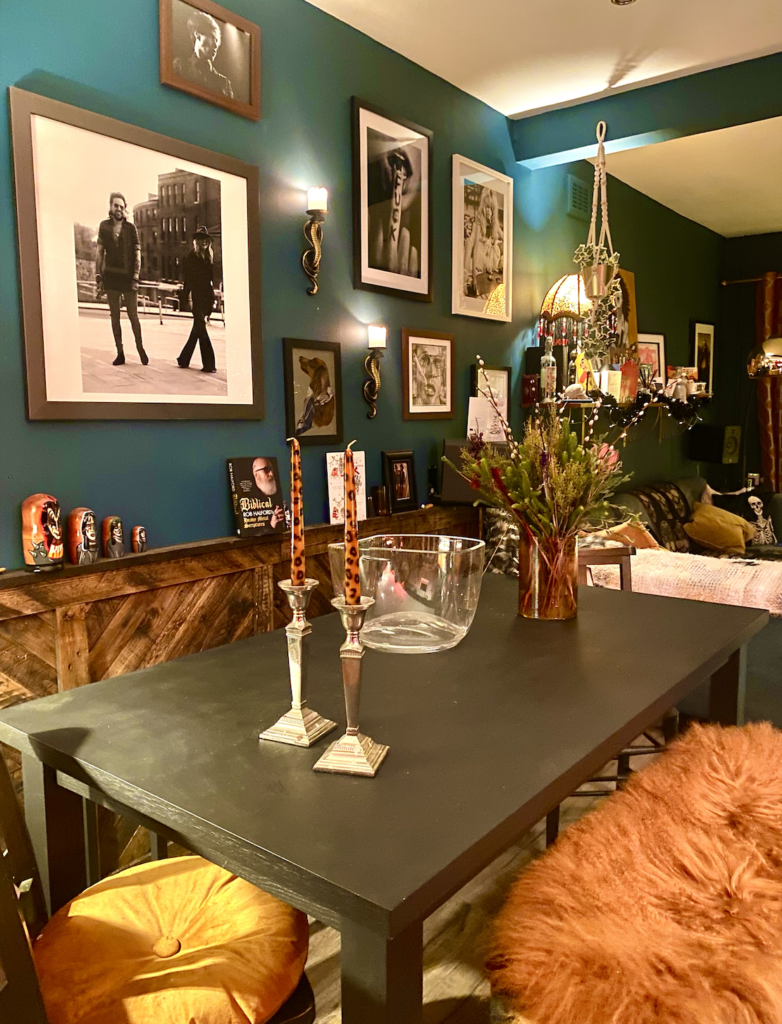
I’m turning the spotlight on to my own home today. Shag Interior began as a humble home account on Instagram ( @shaginterior ) but pretty soon I was working behind the scenes to create a business out of the thing I love: maximalist interiors.
I’ll soon be sharing with you the before and afters of my first three client jobs which are serious transformations, but for now let’s explore some general guidelines for injecting a little maximalist magic into your own home using examples from my own seventies jungle.
Let’s dive in!
1) Clashing. An art form or a free-for-all?
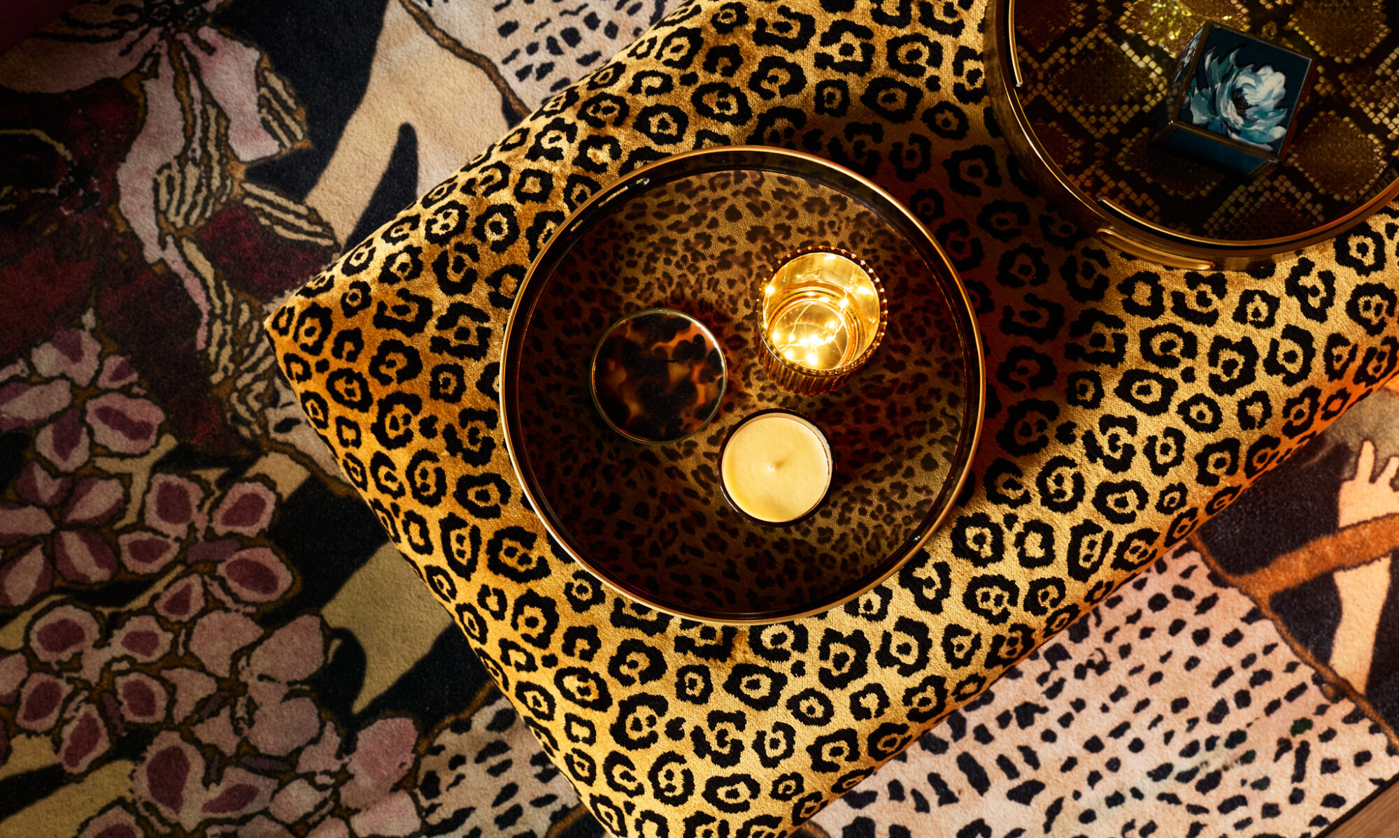
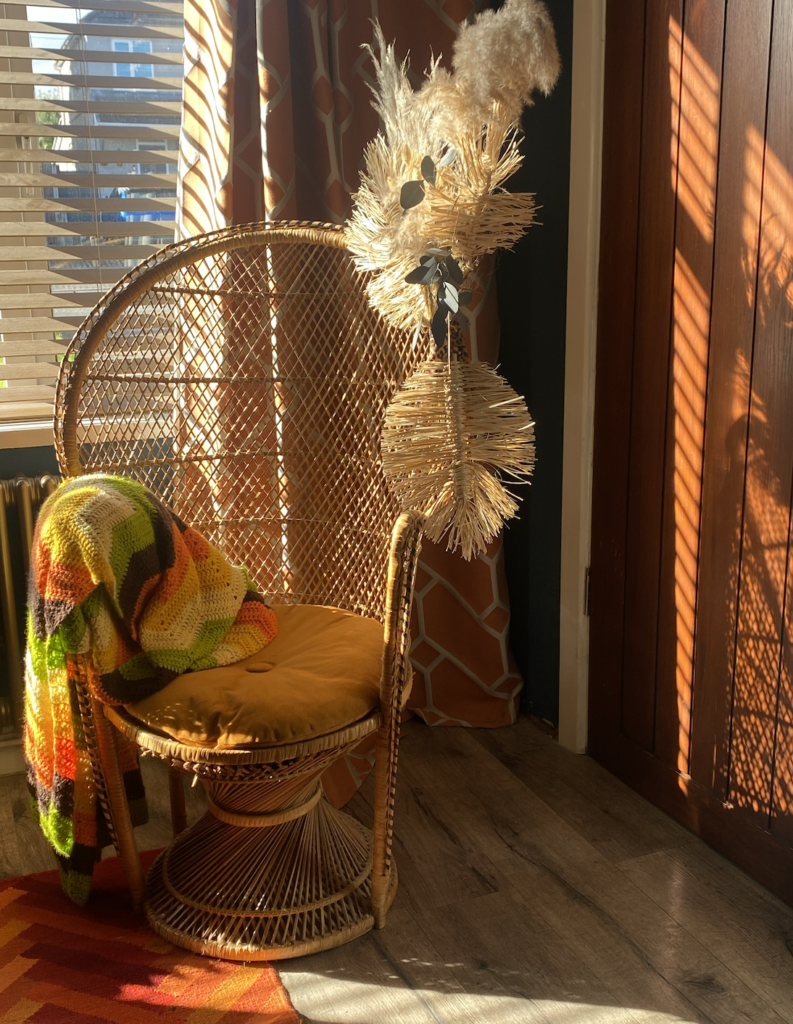
A lot of people think maximalism is just throwing together a clash of colour and patterns, but there is method in the madness. When clashing prints try and stick within the same colour scheme. For example, here you see that despite two busy prints being put together the overall colour palette is fairly neutral with orange/yellow highlights.
The trick is to keep it cohesive. If I was to throw some neon cushions or primary coloured throws into my living room (first picture) it would ruin the balance and the eye would be drawn straight to those objects instead of creating a considered, flowing aesthetic.
The same rule applies to colour clashing.. if you’re ever looking for inspiration just head for nature; flowers, landscapes and wildlife provide the most captivating colour clashes. The red and green rule… total myth. Just play around with the tone of the colours & you’ll find clashes that actually harmonise.
2) Animal prints are neutral.
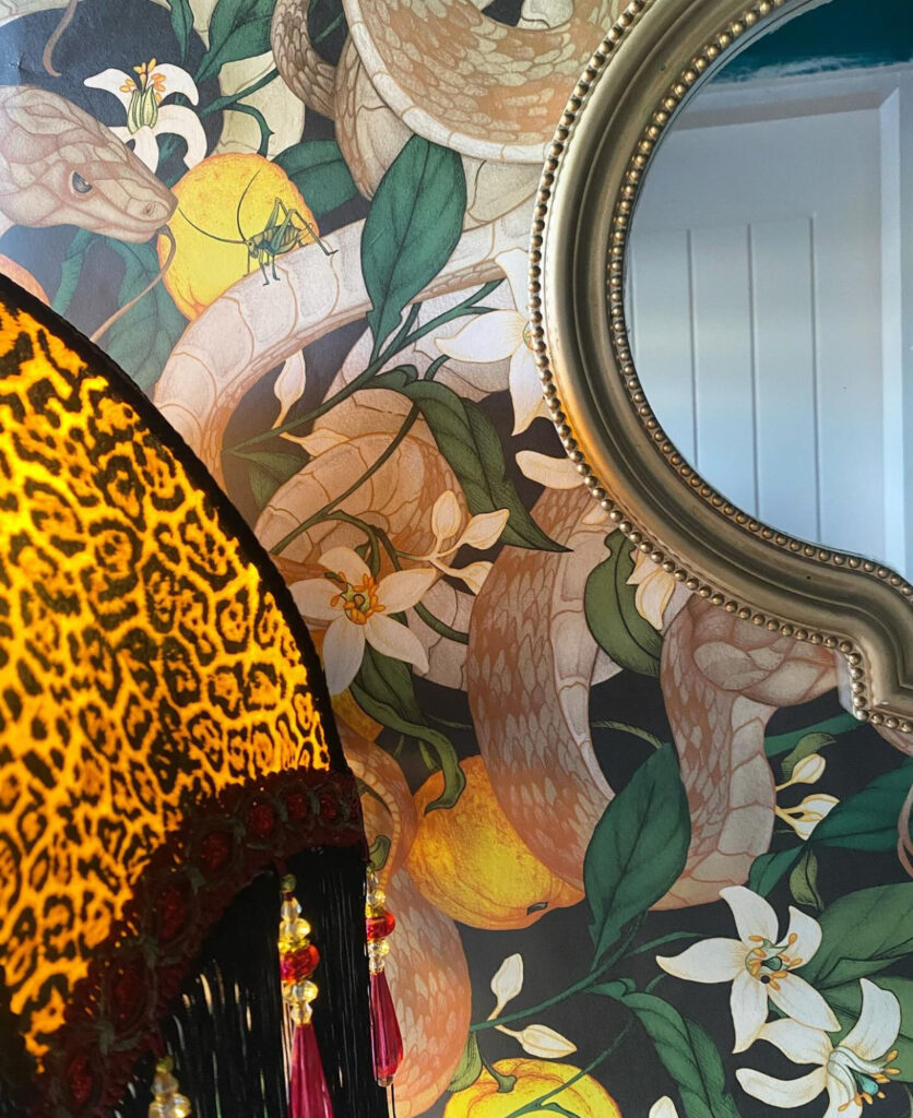
Not just leopard print, most, if not all, animal prints are neutral. This theory is proven over and over again in my home with the continuous use of prints amongst other colours, prints and textures. Botanical and floral prints pair very well with animal prints so take heed from the first point and start clashing!
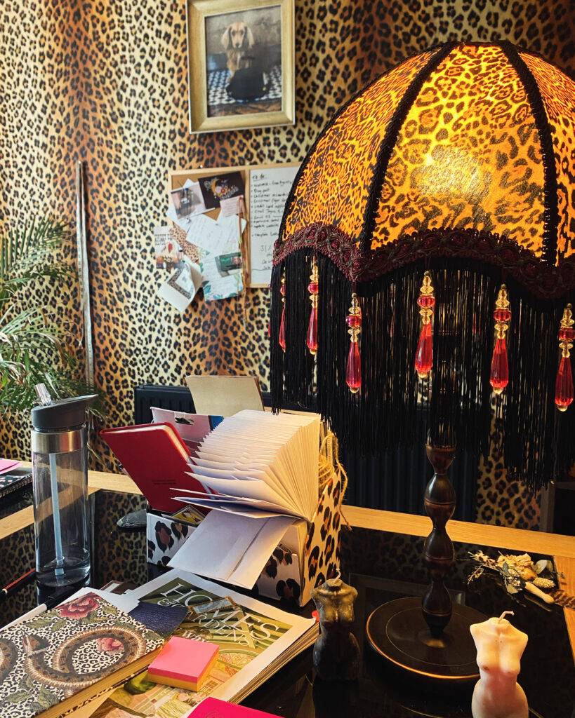
If you have a relatively minimalist home but would like to dip your toe into the maximalist pond why not start out with a few fun cushions and some lovely textured throws to softly introduce the style. I’m a big fan of using leopard print on leopard print but make sure to use an alternative size or colour print so that there is some depth to your build.
3) Asymmetry is king.
A personal home style commandment of mine is embrace asymmetry. Maximalism is about freedom, expression and fun. Try to avoid matching furniture/decor, mis-matched pieces are far more interesting for the eye and brings a sense of adventure to the space.
Identifying symmetry in your home may be difficult if you are used to perfection. For example, two candle sticks either side of a mantlepiece with a mirror in the centre is symmetry.
It’s predictable, it’s a bit boring.
To improve this setup I would put both candlesticks on the same side, burn one of the candles shorter than the other (and allow that lovely wax to drip!), then I would drape something over the opposite top corner of the mirror.. some foliage always works a treat.
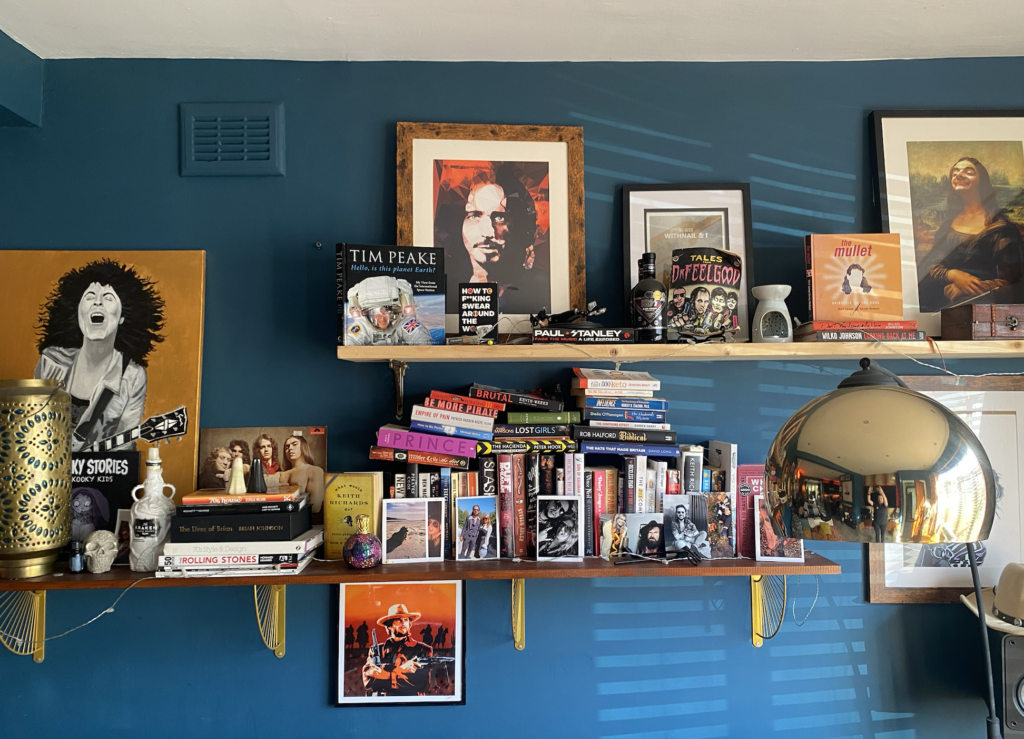
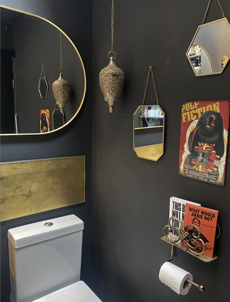
There’s tons of little adjustments you can make to ease up that regimented look of symmetrical placement. Drape a throw off one side of the couch. Create gallery walls instead of perfectly spaced frames that are all the same size.. You get the idea.
Variety, variety, variety.
Sometimes all it takes to perfect a maximalist room is just removing the symmetry. Remember, odd > even.
It really does create a much more relaxed, cosy feel.
4) Play around with height.
Lighting from different heights dramatically improves the overall look of a room. Hanging things from the ceiling adds depth and draws the eye up. A fancy ceiling light brings the style to the ceiling and creates an overall cohesive and finished look. Shelves are a great way of using the height of your walls to create interesting spaces.
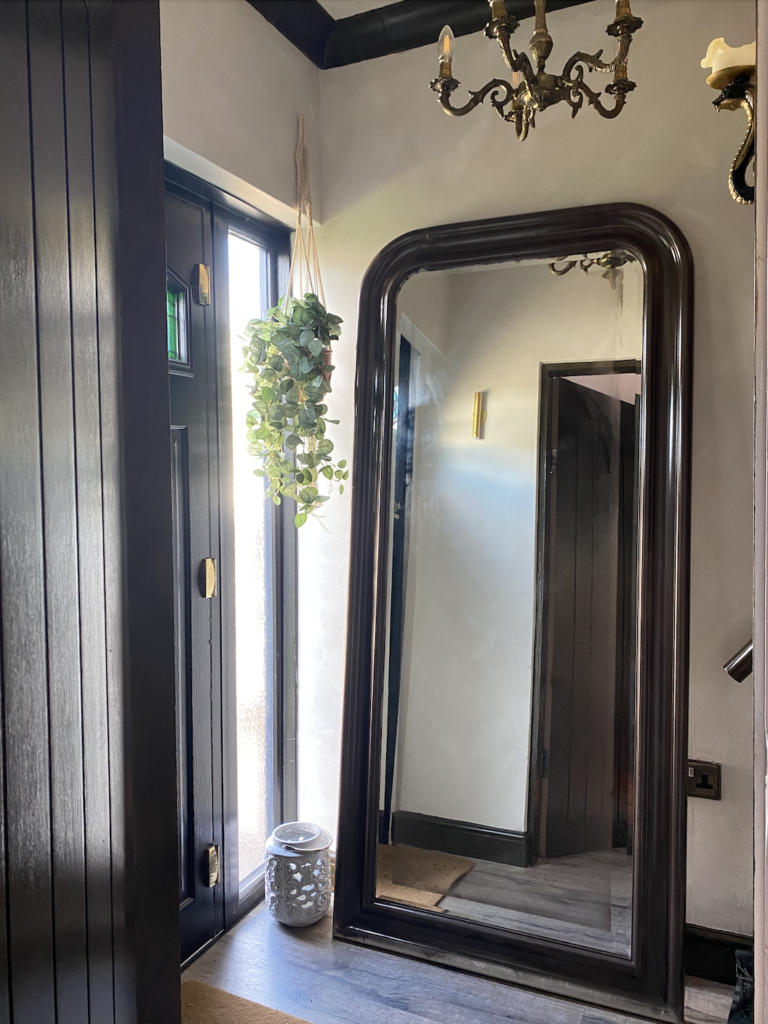
If you’re lucky enough to have super high ceilings in a period property you can play with highlighting the original features such as coving and ceiling roses to emphasise the character.
If you live in a new build or somewhere with low ceilings but you want to trick the eye there are a number of paint illusions you can use to elongate the room.
And while we’re at it, paint your ceiling an interesting colour. White is boring. Colour drenching has a dramatic effect whilst going bolder with a tone from your wallpaper will really set you apart as a master maximalist.
5) Layer, layer, layer!
Maximalism is all about building layers. Different textures layered on top of each other creates a rich and plush focal point. I’m also a big believer in using busy wallpaper as the perfect backdrop for a gallery wall or shelves.
Many people think that if they use printed wallpaper the walls cannot be covered up but this is a mistake. Your wallpaper will look even more incredible and high end with a collection of things on top of it.
You might think it will look too busy but it has the opposite effect; printed wallpaper is easier to digest when the block of pattern is broken up.
6) Natural materials look effortlessly maximalist.
Exposed wood, brick, leather and concrete look wonderful when put with opposing textures like sheepskins, velvet and fuzzy throws. Play around mixing raw, tough materials with softer ones, throw in some interesting plants and you’ll get a very Abigail Ahern-inspired look.

Lime wash and micro-cement walls are hugely on trend right now but if done well it will be timeless. Using earthy tones will keep a neutral base to work from meaning you can evolve your style against a subtly textured backdrop that will look great for many years.
7) No storage? No problem.
Maximalism lends itself to curiosity-shop style displays. One challenge we have in our house is the lack of storage.. but there are ways to overcome this without selling everything you own (although a good purge every now and then is also good for the soul).
Go big with your shelving, don’t be afraid to use up the entire width of a wall. Use different ways of stacking books, add lighting, make sure to have a variety of height and use the space to cleverly store whatever you need to.
Use alcoves to build cupboard space and make sure you are using the best layouts for your rooms to maximise your space. Ottomans are also a great space-saver.
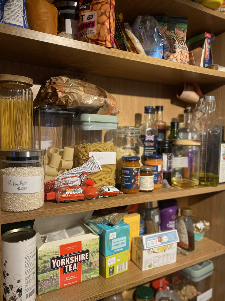
We have a really small kitchen but use our under-the-stairs space adjecent to the kitchen as a tiny pantry.
I nearly got rid of this cheap old bookshelf when I moved house but I’m glad I didn’t as it’s come in handy!
We use it to store dry foods and we bought storage jars for things like oils and pasta to reduce the amount of packaging. This has helped keep everything organised and look neat and tidy.
We also use caddies for cleaning supplies to keep under the sink in order and small boxes in a kitchen drawer for medicines and first aid stuff.
By removing the boxes and packaging from things you free up a lot of space so grab a label maker and get cracking, it’s wonderfully therapeutic!
We also recently bought a coat stand which now sits in a nook next to the door to the W/C. It’s great because we hang faux fur coats and stylish jackets on this which looks great but it doubles up as additional storage!
8) Don’t forget your personality!
The best thing about embracing maximalism is putting your own personal stamp on your home. Brad and I have collected a lot of cool trinkets over the years and many of these are on display on shelves, tables, windowsills and every other nook and cranny! It’s our way of bringing our travels and experiences into our home and a lovely reminder of a certain holiday or concert.
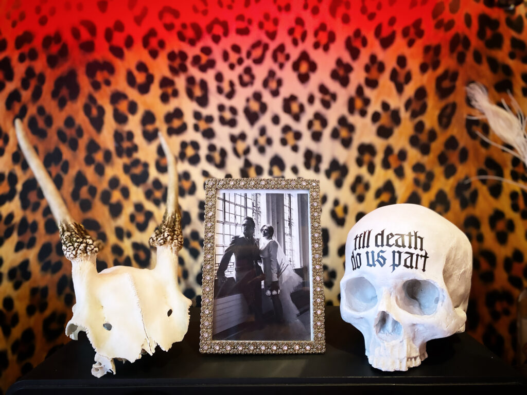
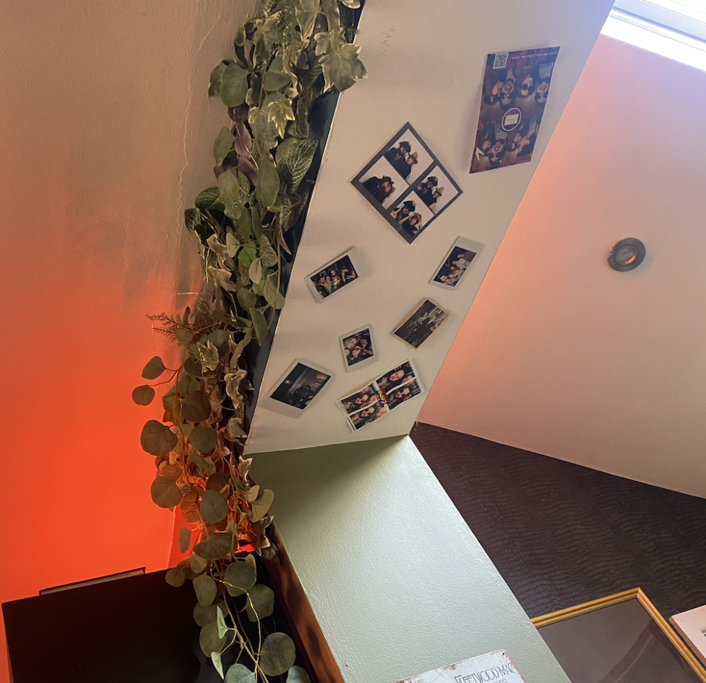
I also love to use photographs everywhere. Framed on shelves and on the walls, unframed propped up against a book, we even have a polaroid archway that we keep adding to! Photographs are so special and something you can continuously update.
In a world of instagram and filters do yourself a favour and go and print out a load of your favourite/funniest photos. They’ll instantly make you smile and allow your home to start to look a bit more like you.
