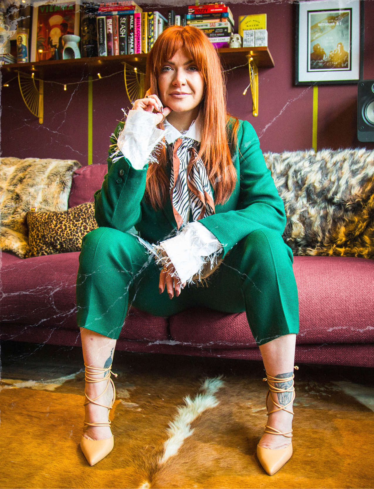
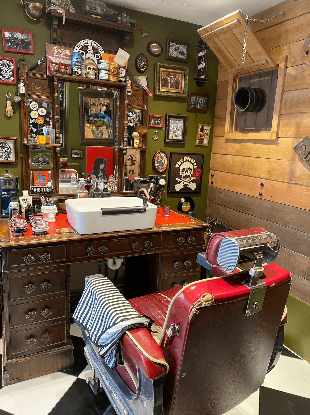
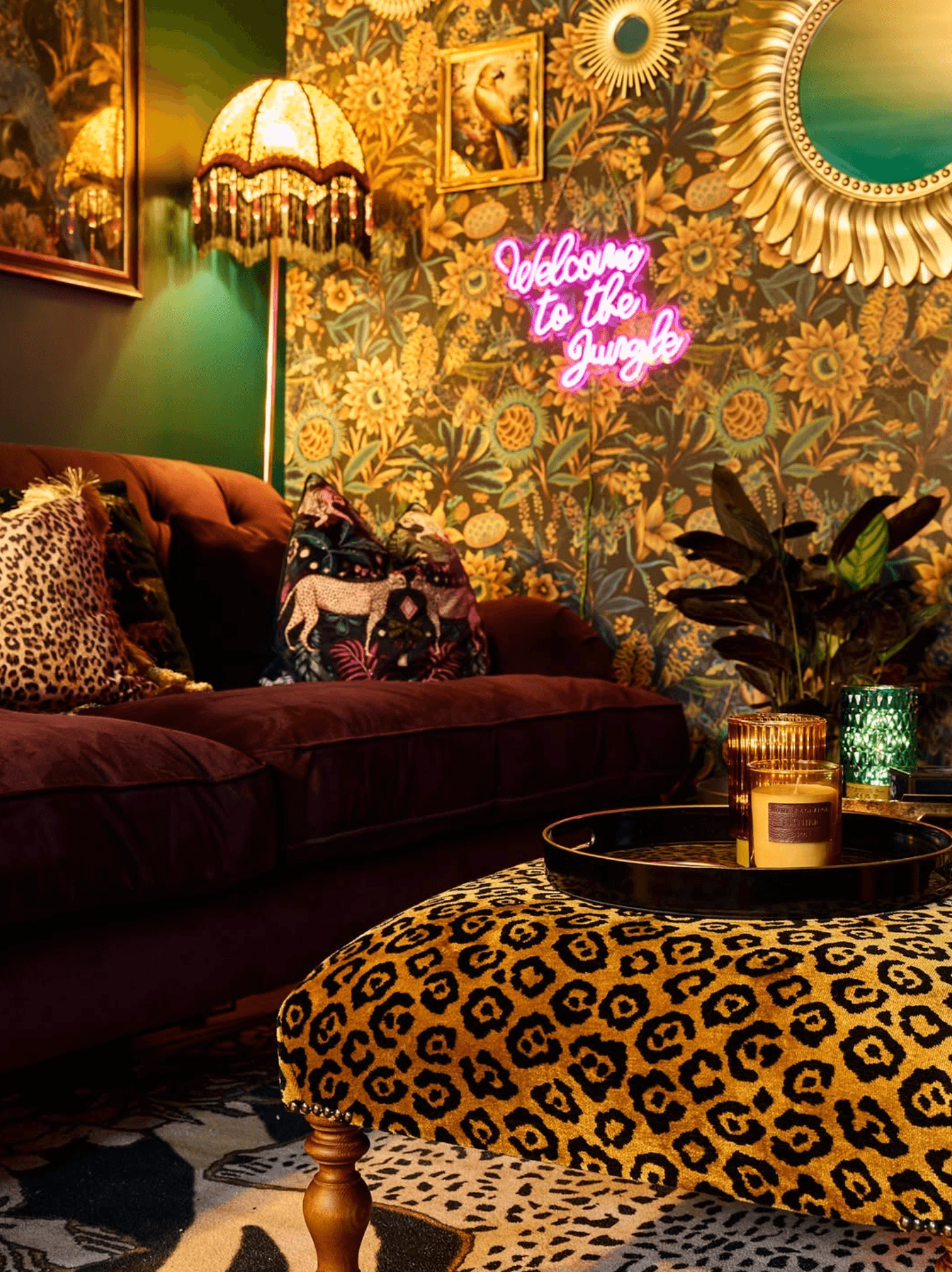
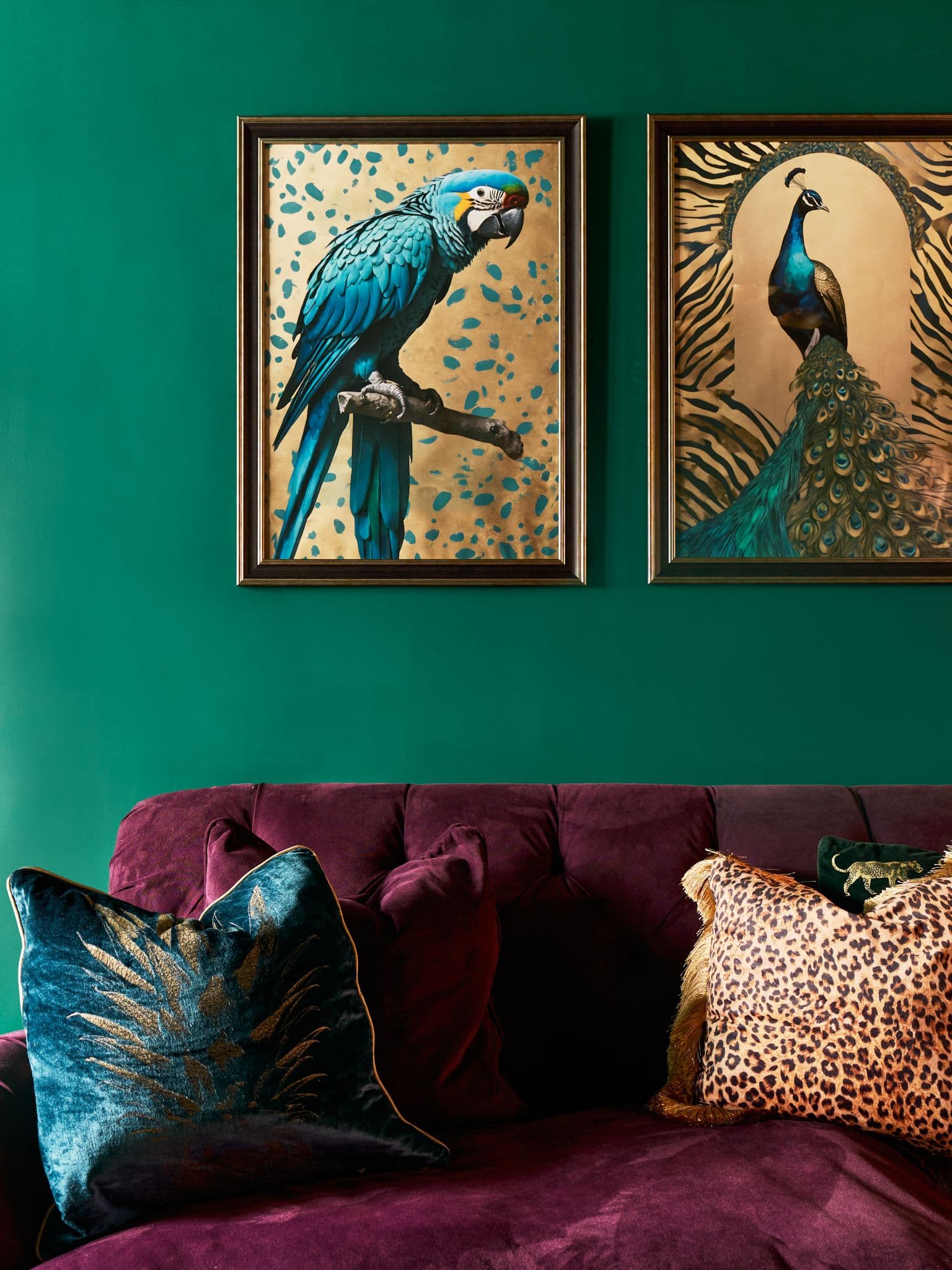
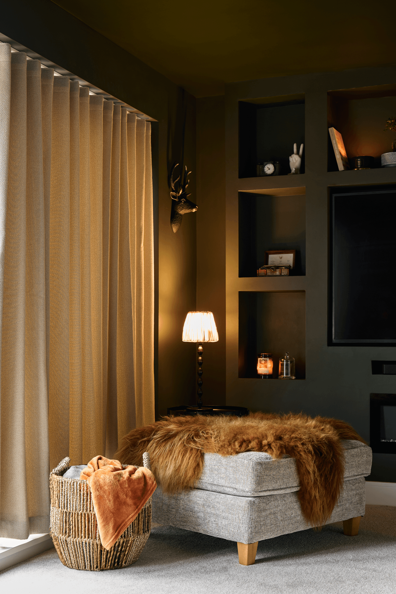
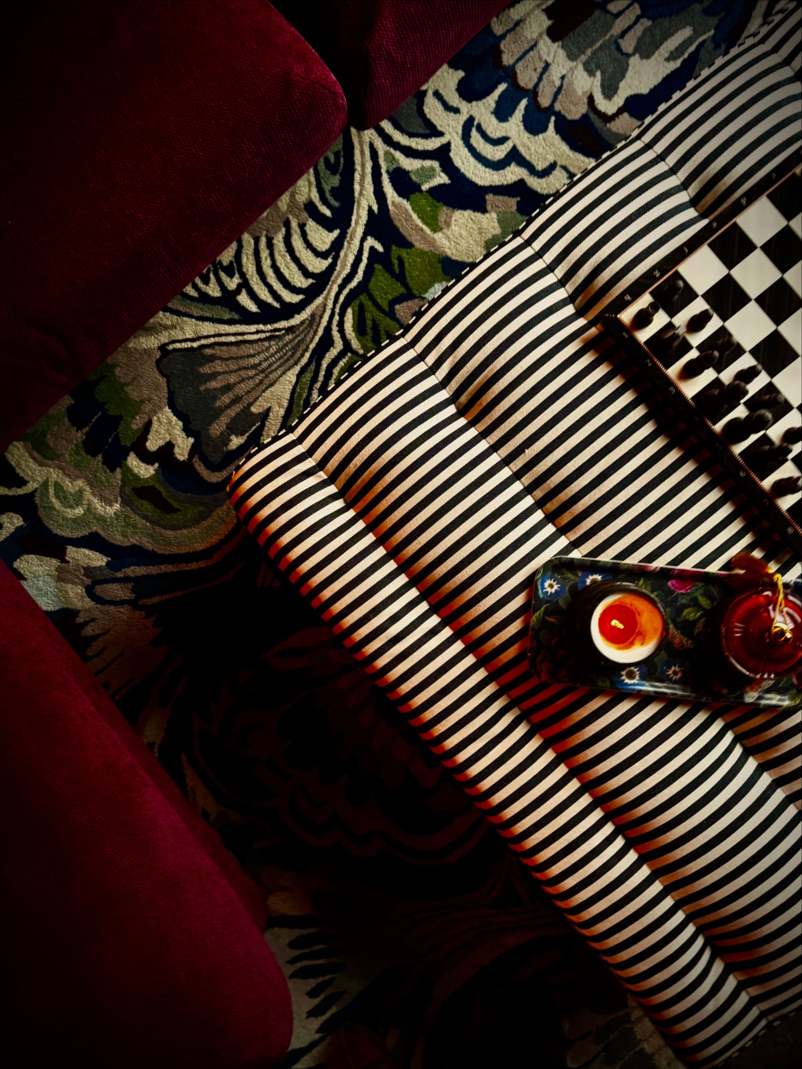
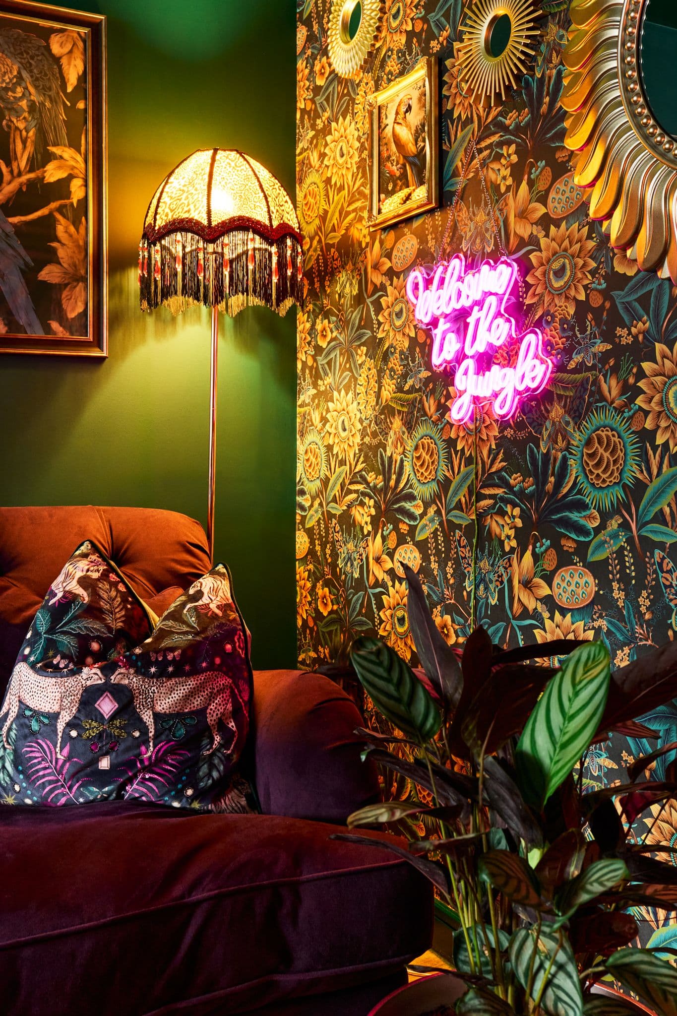
Interior Design: The Art of Clashing

Shag Interior HOW TO: Clashing

Source: blog.thony.com.br

Arguably one of the hardest interior design techniques to get right, clashing is a brave choice, but when done right the results are bold, eye-catching curations that compliment, not overwhelm.

As a maximalist I LOVE to clash… whether in my own home interiors or my dress sense. I love to throw together a few different patterns, colours and textures and create spaces and outfits that are visually interesting… or, “looking like I’ve done a cartwheel through Dunelm”, as my fiance would say.

Now, you can read design books, study the science of colour or search Google for the rules of clashing, but I think it simply comes down to a few basic things:

  • Sizing

    When it comes to prints, try clashing with different sizes. What I mean by this is by having lots of loud designs all in one place causes them to compete for your eye rather than compliment the one another. Take a smaller, animal print under a larger, floral one for instance. It works, they both allow the other one to breathe and look really good together. Source: spoonflower.com

  • Juxtaposition
    I like to clash completely opposing prints/textures. Why? It’s true what they say, opposites attract! And not only that, there’s often something so delightful in this technique. Tough leather upholstery softened with fuzzy cushions.. textured wallpaper clad with artwork.. Minton tiles sitting beneath a cotton candy pink front door.. Juxtaposing styles officially work.

    Source: Pinterest
  • Tone
    Picking two colours to clash together could lead to a design disaster.. think about the tone of the colour and the mood you are trying to create. We all know that primary red and bright green look

    pretty awful together. But have you tried a Mulberry with an Olive? Now that’s a cute clash. Colour-clashing is way more mainstream now than it used to be, just look at how red and pink are often seen together. If you’re new to mixing colours then try out these combos and see if any tickle your fancy:

    Sea green & light pink

    Blue and brown

    Orange and pink

    Another colour-clash trick it to mix two tones of the same colour, it’s a safer option for those just wanting to dip their toe in to the world of clashing and can bring a subtle clash to an otherwise minimalist/neutral space.

  • Texture

    It’s not just prints and colours that make for magnificent clashing.. I love to mix up the textures in a home, particularly with natural materials to create cosy atmospheres. Wooden beams, exposed brick, fluffy sheepskins and industrial-style metals are a good example of how mixing up textures in your space can drastically impact it in the best way. And you don’t have to go overboard and start installing beams to achieve this clash either. Try simple linen bedding offset with a glamorous, velvet throw; or rattan light shades hanging from a dark-painted ceiling.

Source: Pinterest

If you follow these rough guidelines I guarantee you you’ll start to figure out your own maximalist style and how clashing can work for you. It’s easy to master once you’ve got an eye for it so go and have fun, and don’t forget to tag me in your pics!


Although I’ve set out some ‘rules’ to follow the main thing to remember is interior style is personal and subjective, so have fun creating spaces that make you HAPPY!

Like this? Let's connect on socials!

Want to dip your toe into Maximalism?

You'll recognise the motif from the image of the wallpaper above... Well we have this gorgeous print available which was done exclusively for Shag Interior by the clever creatives at Nuthatch Grey. They are limited edition and each one is signed and numbered for authenticity, I am down to my very last one available for sale so go grab it now! Available framed or unframed!

Leave a Reply

Your email address will not be published. Required fields are marked *